Related Categories
Related Articles
Articles
Value Line Geometric Index
All-Time-High
This index is great at providing insight into the current condition of the U.S. stock market: the Value Line Geometric Index (XVG). This index tracks the median move of stocks within the index using the assumption that each stock has an equal...
 ...amount (for example, USD 1,000) invested in them. The daily average move of this index is calculated geometrically (rather than arithmetically).
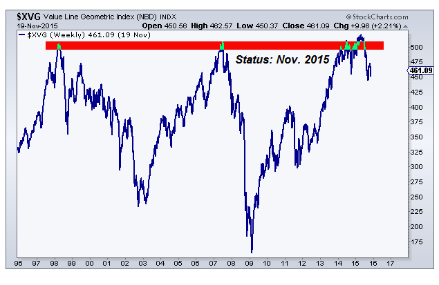
The Valueline Geometric Index ($XVG) is now approaching new All-Time-Highs again. It has tried to reach new highs in 2015 but failed to reach and/or hold these levels above 500 points. We can see the three previous peaks in around 490 (500 points). The three previous major peaks on $XVG of 1998, 2007 and 2015 are the month end closes. The Intra-month highs were slightly higher at ca. 510 points.
We are looking at the original equally-weighted Value Line Index, also known as the Geometric Value Line Index, which consists of around 1,700 names and assumes an equal dollar amount invested in each stock covered by Value Line. This gives us a better indication of the performance of the overall stock market as opposed to large-cap stocks or particular segments of the market. The first chart above shows the timeframe running up towards the previous highs in 1998 and 2007 - AND >> Then the problem in the year 2015 was, that a breakout above the former ATH-levels failed to hold.
STATUS QUO (Q4-2017, Jan. 2018)
In the last quarters the "VALUG" eventually managed to take out the decade(s)-long lasting All-Time-High(s) and managed to establish a new plateau ABOVE levels of 510 points. Currently the Index is hovering more than 10% above these former ATH-levels. Let's see if the index can stay above the level of 500 (510 points) over the next quarters:
Definition:
On 30th June 1961, ValueLine introduced the Value Line Composite Index. This market benchmark assumes equally weighted positions in every stock covered in The Value Line Investment Survey. That is, it is assumed that an equal dollar amount is invested in each and every stock. The returns from doing so are averaged geometrically every day across all the stocks in The Survey and, consequently, this index is frequently referred to as the Value Line (Geometric) Average (VALUG). The VALUG was intended to provide a rough approximation of how the median stock in the Value Line universe performed.
On 1st February 1988, Value Line began publishing the Value Line (Arithmetic) Average (VALUA) to fill a need that had been conveyed to ValueLine by their subscribers and investors. Like the VALUG, the VALUA is equally weighted. The difference is the mathematical technique used to calculate the daily change.
The VALUA provides an estimate of how an equal-dollar weighted portfolio of stocks will perform. Or, put another way, it tracks the performance of the average, rather than the median, stock in our universe. It can be shown mathematically, for all practical purposes, that the daily percentage price change of the VALUA will always be higher than the VALUG. The systematic understatement of returns of VALUG is a major reason that the VALUA was developed. Moreover, although the differences between daily price changes may seem small, the magnitude of the annual differential between the two averages can be very large. The greater the market volatility, the larger the spread between the geometric and arithmetic averages becomes!!
Insights-Info:
In 1965, when The Value Line Ranking System for Timeliness began, the only market average computed by ValueLine was the VALUG, so they scored the ranks on a geometric basis. This allowed ValueLine to compare the performance of the ranks versus the market (as measured by the VALUG). After they started the VALUA, ValueLine began scoring the ranks both on a geometric and arithmetic basis.
links:
http://stockcharts.com/articles/canada


